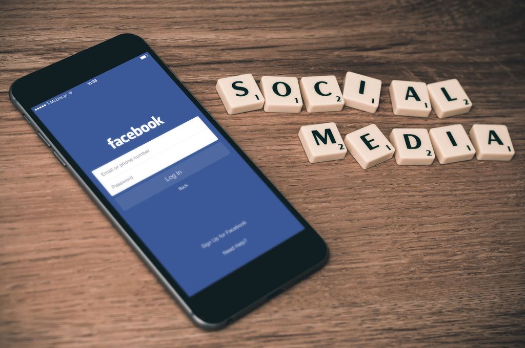
Can't Stop Scrolling: How Social Media Is Designed To Be Addictive
Photo from unsplash. by William Iven
By
Allyson Escobar,
Anurag Papolu
If your first thought waking up this morning was to grab your phone and check Facebook, you’re not alone. According to a 2017 Deloitte global consumer survey, 89 percent of smartphone users admit to checking social media within the first hour of waking up. The same goes for nighttime: 81 percent of responders look at their phones before going to bed.
According to Statista, as of January 2018, Facebook remains the leading social network, with 2.2 billion monthly active users, and closely followed by YouTube and WhatsApp.
With glaring red notifications pushing the home screen and looping videos filling up the newsfeed, social media is purposely designed to make users engage, interact and keep scrolling.
By using specific interactions such as pop-up notifications and likes, social media platforms are designed to encourage certain kinds of reactions.
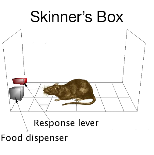
Nir Eyal, author of the book "Hooked: How to Build Habit-Forming Products”, argues that successful social media sites and apps use the same technique behind slot machines, called the variable ratio schedule.
In the 1930’s, Harvard psychologist B.K. Skinner demonstrated variable ratio schedule by getting rats in a box to hit a lever for a reward: food. Skinner found that the rats would hit the lever most frequently when the ratio of hits to receiving food changed every once in a while.
With this line of thinking, in variable ratio schedule, the user is the rat. The irregular, pop-up notifications you receive on social media is the food, and constantly checking them is the act of hitting the lever.
Nir Eyal describes the relationship between Skinner's box and social media use.
Ynah Santos, a self-employed web designer and consultant, agrees that social media is quickly finding ways to “game-ify,” or incentivize, users through “rewards on action and usage--like Snapchat streaks, likes and retweets; ways to incentivize users to keep using the apps.”
“It gives the user a chance to have instant gratification, because they advance one more day in the goal or streak they’re trying to meet,” Santos said. “Like on Apple Watches, they they track your activity, you fill those circles up, and you get some sort of badge.”
Glaring red notification buttons on the smartphone are designed to be addictive, making the user want to click.
X
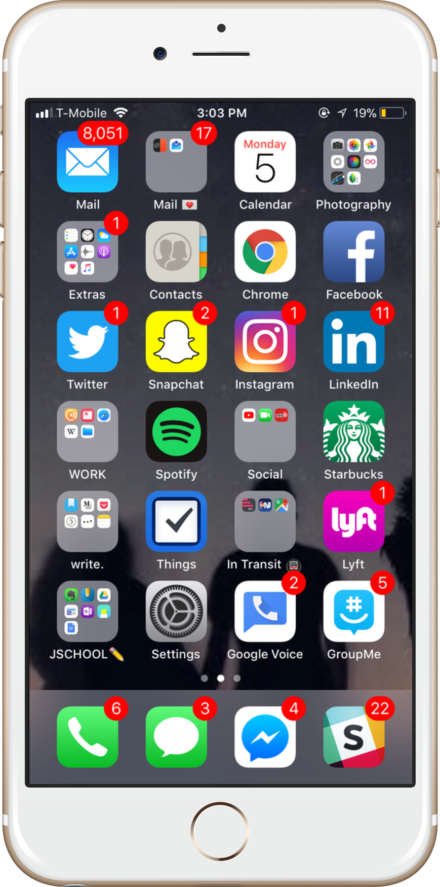
Texts, emails, Facebook likes and Instagram directs--The iPhone home screen’s big, bright red push notifications are designed to scream for your attention.
Aaron Marcus researches the principles of effective visual communication in graphic user interface design.
"The use of bright colors for danger signals, attention getters, reminders, and cursors is entirely appropriate," Marcus writes. “High chroma red-alerts seem to aid faster response than yellow or yellow-orange if brightness is equal. When too many figures or background fields compete for the viewer’s attention, confusion arises...simplicity, clarity, and consistency are especially important for color design.”
Researcher Francine Frome also studied the spectral sequence in color coding, and discovered red, green and blue as the intuitive colors for a multi-layer display. As device screen brightness changes a viewer’s perception of depth, Frome discovered, the color red comes forward.
X
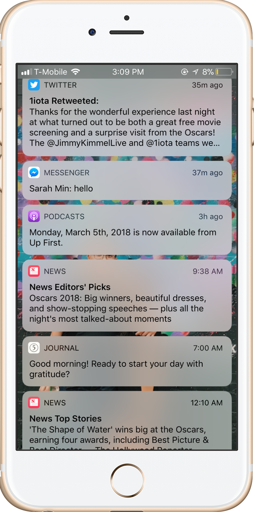
Apple’s new Notification Center brings all of your favorite apps together in an agenda-like, widget interface, almost like pesky little instant messages you have to swipe to clear.
Adding to the narrative, platforms like Facebook, Google and Instagram have implemented complicated algorithms and that make engaging on social media even more enticing.
“It’s true in terms of the color design that a lot of social media uses, especially what keeps their user base. Look at Tumblr, Twitter, Facebook; their main color is blue,” said Santos, 24. “Even with [Apple] iMessage, people prefer texting other blue iMessage users compared to the green regular text messaging. Your brain becomes more active and energized when you see the color blue. Even with the natural blue background light on our phones. A bunch of apps that use the color to entice you, not only as a soft vibrant color that expresses something joyful, but blue stimulates the brain enough to keep users engaged.”
X
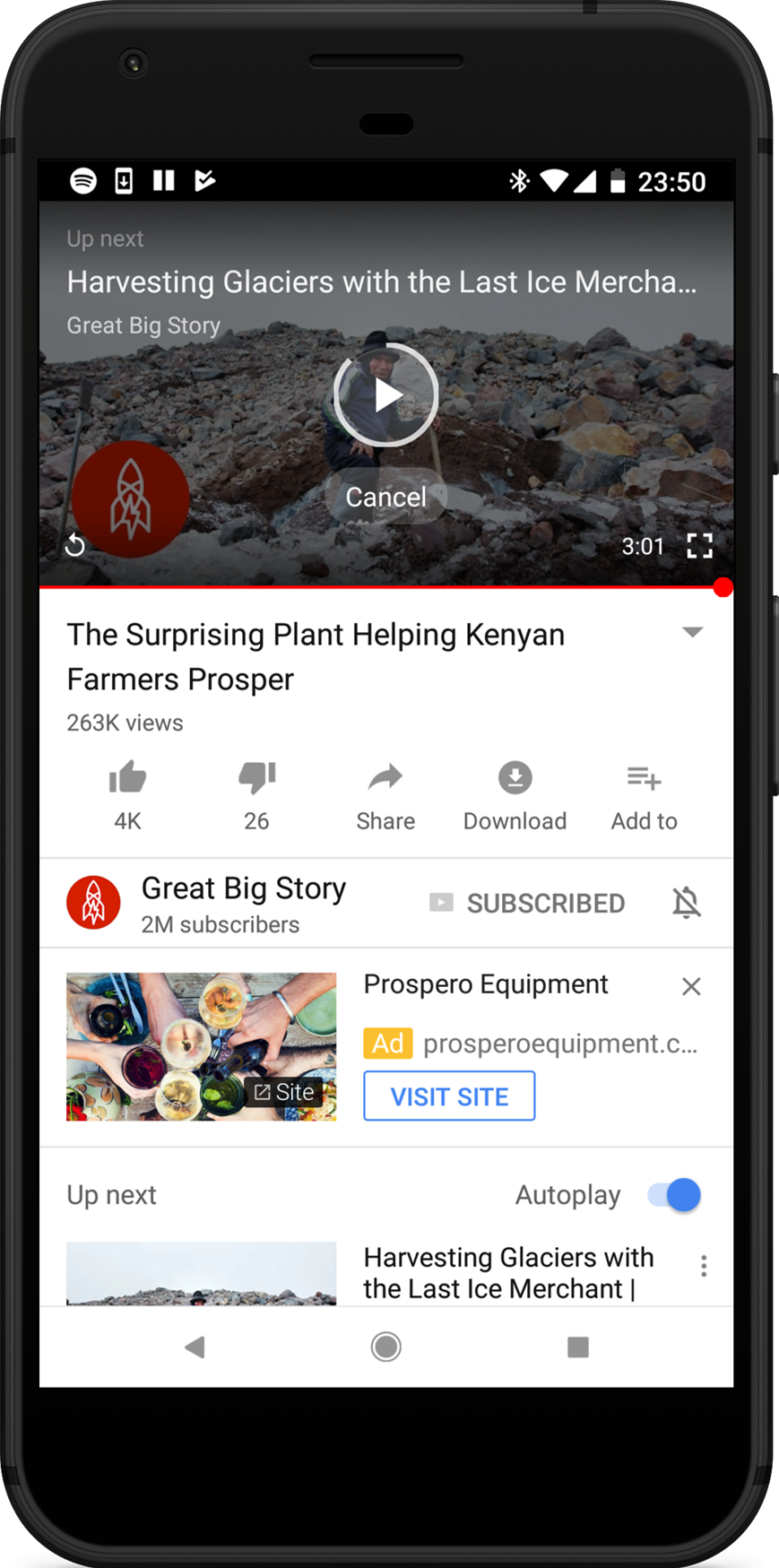
YouTube’s auto-play algorithm funnels through each user’s search and viewing history, with one goal in mind: to keep users watching.
Researchers at Google talked about the “funnel” video recommendation algorithm for YouTube, which boasts 1.5 billion consumers and uses what’s called a “candidate generation” and “ranking” network to filter through hundreds of recommendations, based on user’s query and search history.
“The two-stage approach to recommendation allows us to make recommendations from a very large corpus (millions) of videos, while still being certain that the small number of videos appearing on the device are personalized and engaging for the user,” write Paul Covington, Jay Adams, and Emre Sargin.
Much like the variable ratio and Skinner’s rat experiment, the feedback loop of social media involved is designed to keep the user entertained and engaged to the point of near-addiction, always coming back for more.
X
Phones, tablets, laptops on the go--there’s a device for every one of your social networks.